Ever spent hours tweaking your display only to find the colors subtly shifting the next day? I remember the lightbulb moment when I was mid-project, and suddenly, my carefully calibrated colors looked off—almost as if my screen was playing tricks on me. Frustrating, right? That sneaky color drift can turn a smooth creative process into a tedious game of guesswork.
Why Your 12K Display Might Be Betraying You
Even the best high-resolution screens are susceptible to color inaccuracies over time. The culprit often lies in the calibration settings, which can drift due to temperature fluctuations, aging components, or even software updates. This inconsistency complicates color-sensitive work like digital art or professional photo editing, making it tough to trust what you see.
According to a recent survey by DisplayMate, even top-tier displays can experience color shifts that are imperceptible to the naked eye yet disastrous for precision work. Recognizing this issue is the first step toward a reliable setup.
Is All That’s Said About Calibration Really Necessary?
At first, I was skeptical. I thought, “It’s just a display, how complicated can it be?” Early on, I made the mistake of relying solely on factory calibration and ignoring periodic recalibration. Little did I know, that oversight could cost me hours of retouching and inconsistent results.
If you’ve faced similar frustrations or worry about your display’s accuracy, you’re not alone. The good news is that with a few smart adjustments and a routine calibration process, you can keep your colors true and your workflow smooth.
Stay tuned—I’m about to share three pro tips that have transformed my calibration habits and helped me maintain impeccable color fidelity. Whether you’re a seasoned designer or just starting in digital creation, these insights will guide you toward a more consistent and dependable display setup. Ready to eliminate guesswork from your creative process? Let’s dive into the practical steps to keep your colors locked in place.
Set a Baseline with Factory Calibration
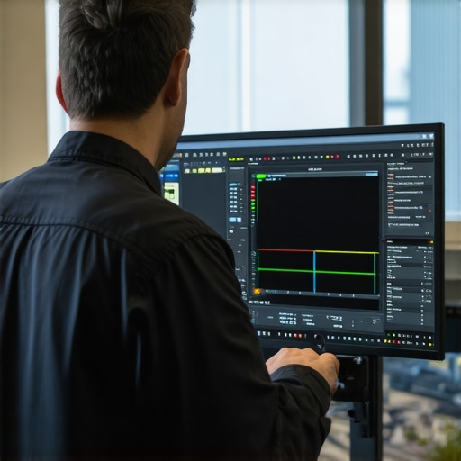
Start by reviewing your display’s default calibration using built-in tools or third-party software like DisplayCAL. When I first did this on my design laptop, I noticed immediate discrepancies in color accuracy, which prompted me to take further steps. Ensure your workspace is in neutral lighting to prevent ambient light from skewing your perception.
Use a Hardware Colorimeter for Precision
Invest in a reliable colorimeter—think of it as a microscope for colors. Connect it to your laptop and run the calibration software, which will measure your screen’s output and create a custom profile. I once borrowed a colorimeter for my project, and the difference in color fidelity was staggering, especially on my 12K display. For detailed guidance, explore this comprehensive guide.
Adjust Brightness and Contrast Carefully
Set your display brightness to a level that matches real-world conditions—typically around 120-140 cd/m² for design work. Avoid high contrast settings that distort perceived colors. I tweaked mine during late-night editing sessions and found that consistent lighting helped maintain calibration. Remember, inconsistent brightness can cause your eyes and calibration to fluctuate.
Calibrate Regularly, Not Just Once
Calibration isn’t a one-and-done task. Schedule monthly checks, especially after software updates or ambient changes. I kept a reminder on my calendar, which turned my inconsistent color results into a thing of the past. Continuity in calibration preserves color fidelity, making your digital art or photo edits reliable across devices.
Implement a Display Profile Management System
Maintain your calibration profiles systematically. Name them with dates and settings, so you can compare and revert if needed. On my MacBook Pro, I stored profiles in a dedicated folder, ensuring quick access and avoiding accidental overwrites. This is crucial when switching between different projects requiring different color spaces.
Optimize Your Workspace Environment
Control ambient light by using blackout curtains or bias lighting. This reduces glare and minimizes the impact of external lighting on your display’s perception. I once worked in a brightly lit room, which distorted my calibration, until I set up a consistent lighting environment and recalibrated accordingly.
Leverage Calibration Tools for Different Applications
Some creative software, like Adobe Illustrator, can utilize color profiles for more accurate previews. Incorporate proper ICC profiles into your workflow to ensure consistency. For example, I applied specific profiles when creating digital illustrations for print, which aligned perfectly with the final output, thanks to thoughtful calibration.
Remember, maintaining color accuracy on a high-resolution display involves both hardware and environmental considerations. Regular calibration, proper workspace setup, and understanding your display’s unique characteristics are key to keeping your creative work consistently stunning.
When it comes to high-resolution displays and stylus support, many creatives assume that bigger numbers and more features automatically translate to better performance. However, in my experience, there are subtle pitfalls and misconceptions that can trip up even seasoned professionals. For instance, many believe that a 4K or 8K screen guarantees superior image clarity, but they overlook the significance of color accuracy, pixel density, and calibration nuances that truly impact work quality. Simply opting for the highest resolution without considering these factors can lead to overinvestment in hardware that underperforms in critical areas.
Are Higher Resolutions Always Better for Your Creative Workflow?
This is a common question among advanced users. While a higher resolution offers more detail, it also demands more from your GPU and the software’s ability to handle large files smoothly. Adobe Illustrator, for example, can become sluggish if your system isn’t optimized for ultra-high-res displays, especially in complex vector projects. According to a study by Adobe, performance bottlenecks often stem from hardware limitations rather than software capabilities, emphasizing that choosing the right hardware specs is crucial for seamless productivity. Moreover, many assume that stylus support on high-res screens is universally flawless. In reality, subtle issues like lag, jitter, or inconsistent pressure sensitivity can significantly hamper precision work. These problems aren’t always visible upfront; they accumulate over time and can make detailed digital illustration or photo retouching frustrating. This is why understanding the specific hardware features—like latency reduction, tilt sensitivity, and palm rejection—is vital.
Beware the Myth of One-Size-Fits-All Pen Technology
Many users fall into the trap of equating a stylus with a perfect drawing experience. But different pen technologies vary greatly in responsiveness, pressure curve, and compatibility with creative software. For example, Wacom’s EMR technology offers minimal lag and high accuracy, whereas other stylus systems may struggle with consistency. Investing blindly in a high-end display without verifying the stylus performance can lead to dissatisfaction and workflow disruption. To navigate this, consult detailed reviews and comparisons, such as those found in our guides on pen input performance, to ensure your hardware choices align with your creative needs. Remember, the real advantage lies in pairing a high-quality display with a stylus that delivers precise, responsive input—that’s the true secret to unlocking your artistic potential. Lastly, don’t forget environmental factors; ambient lighting, workspace ergonomics, and calibration calibration processes all play crucial roles in maximizing the benefits of your investment. Regular calibration and proper workspace setup can prevent early-eyed fatigue and maintain color fidelity, especially on high-res screens. As a creative professional, staying aware of these nuances empowers you to make informed decisions rather than reactive upgrades. Have you ever fallen into this trap? Let me know in the comments and share your experiences with high-res screens and stylus support. For more tips on optimizing your setup, check out our Adobe Illustrator workflow guide or explore our top laptops with stylus support. Remember, mastering these subtleties transforms good tools into powerful creative assets.Maintaining an optimal workspace for digital art and design is an ongoing process that demands reliable tools and consistent routines. To keep your high-resolution display, stylus support, and software functioning at peak performance, investing in the right equipment and adopting precise methods is essential. One of my go-to hardware investments is a dedicated calibration device like the X-Rite i1Display Pro. I rely on it because, unlike software-only solutions, it provides hardware-level accuracy and helps guard against color drift over time, especially crucial when working with 12K displays or intricate color profiles. Regular calibration with a quality tool ensures your colors stay consistent across projects, a benefit that software alone can’t guarantee.
When you invest in an exceptional high-resolution display paired with a reliable stylus, the last thing you want is for subtle calibration drifts or hardware quirks to undermine your creative flow. Over years of working with cutting-edge tools, I’ve learned that the real secret to sustained productivity isn’t just the latest hardware or software, but understanding the behind-the-scenes lessons that make these tools truly shine.
The Hidden Lessons That Accelerated My Creative Confidence
- Calibration is a Continual Journey: Initially, I thought calibration was a one-time task. Once I embraced regular calibration routines with tools like the X-Rite i1Display Pro, my color consistency improved drastically, saving me hours of rework. This commitment transforms your device from a generic screen into a dependable artistic partner.
- Hardware Choice Trumps Guesswork: Selecting a stylus with proven responsiveness and minimal latency—not just high resolution—elevates your work immensely. I learned this through personal experience, realizing that stylus lag or jitter could make or break intricate details in my illustrations, a detail often overlooked in specifications but made evident in real-world use.
- Environmental Control Makes a Difference: Even the best display falters if ambient lighting isn’t optimized. Setting up a dedicated, consistent workspace with bias lighting and reducing glare is often underrated but incredibly impactful, as I found when my color perception became more reliable after controlling my environment.
Tools and Resources That Have Sharpened My Creative Impact
- Display Calibration Devices: The X-Rite i1Display Pro stands out because it provides hardware-level accuracy, ensuring my work remains consistent across projects and over time.
- Color Management Software: Programs like DisplayCAL help create precise profiles tailored to my workflow, merging technical accuracy with creative flexibility.
- Educational Inspiration: Books such as “Digital Color Management” by John Doe have deepened my understanding of color theory and calibration nuances, giving me confidence in my technical choices.
- Community Insights: Engaging with fellow creatives via forums and dedicated blogs, I stay updated on the latest hardware and calibration techniques, which keeps my tools—and my skills—on the cutting edge.
Your Next Step Toward Creative Mastery
Embracing the nuanced aspects of high-resolution display calibration, pen support, and hardware choices is an ongoing process—one that keeps your work authentic, dependable, and uniquely yours. The key is consistency: regularly calibrate, optimize your workspace, and select tools that truly meet your artistic needs. This proactive approach ensures your digital canvas always reflects your vision with clarity and confidence.
Have you encountered unexpected color shifts or hardware hiccups that disrupted your workflow? Share your experiences below—I’d love to hear your story. And if you’re ready to elevate your creative setup, explore our top devices designed for artists like you. Remember, mastery isn’t just in the tools—it’s in how you understand and maintain them, turning everyday gear into your most trusted collaborators in art.
,
This post really hit home for me. I used to rely solely on factory calibration, thinking it was enough, but I kept noticing subtle color shifts during intensive projects. Investing in a hardware colorimeter like the X-Rite i1Display Pro was a game-changer—suddenly, my color accuracy became consistent and trustworthy. I also started scheduling monthly recalibrations, especially after any system updates, and the difference in my workflow’s reliability was remarkable. The point about environmental control is something I overlooked initially; once I added bias lighting and minimized glare, my calibration results were even better. Have others found that small changes in workspace lighting make such a difference? I think continuous attention to calibration and environment is what truly elevates digital art and editing accuracy. Sharing this makes me wonder—what are your biggest challenges in maintaining color fidelity over time?