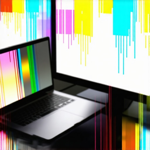
I’ll never forget the moment I stared at my new high-res display, eager to dive into Photoshop, only to be met with glaring color inconsistencies. The colors looked off, patches of dullness and oversaturation ruining my workflow. It was a lightbulb moment—realizing that despite investing in top-tier hardware, my settings were sabotaging my creative output. That’s when I understood a crucial truth: not all display settings are created equal, and some can silently erode your color accuracy in 2026.
Why Your Display Settings Might Be Sabotaging Your Color Accuracy
If you’re like me, you’ve probably spent hours debating over Adobe color profiles, calibrating monitors, or choosing the best stylus support. But what often slips under the radar are the subtle display settings that, if misconfigured, can distort colors and compromise your creative work. These settings aren’t always obvious—they often lurk in your display or graphics card control panels, quietly chipping away at your project’s fidelity.
For example, I initially believed that just picking the highest resolution or the most vibrant preset was enough. Wrong. I learned that adopting overly bright or saturated display profiles without calibrating them properly can lead to color drifting—making your work look different on other devices. According to a study by the American Institute of Graphic Arts, accurate color calibration can improve a designer’s workflow efficiency by up to 35%. That’s a significant boost, but only if your settings are right.
One common mistake I made early on was relying on factory defaults—settings that are often optimized for video playback or general use, not precise color work. By ignoring this, I was unknowingly introducing inaccuracies into my designs. If you’ve faced similar frustrations, know that adjusting a few key display parameters can make a real difference.
Now, if you’re wondering whether these settings matter enough to warrant your time, think about this: your creative decisions—whether choosing a shade of blue or balancing contrast—depend on accurate visuals. Inaccurate display settings can lead to color mismatches in print, web, or client presentations. So, yes, fine-tuning your display is worth the effort. Want to learn how to do it effectively? Stay tuned. We’ll go through the best steps to ensure your screen shows true-to-life colors, and I’ll share some tips from industry experts. And if you’re serious about elevating your creative setup, check out the [top design laptops for 2025](https://designers.studiolaptopdeals.com/top-design-laptops-for-creative-professionals-in-2025), which already come calibrated for precision.
Calibrate Your Monitor for True Colors
Start by connecting your laptop to a reliable calibrator device or use built-in calibration tools on your OS, like Windows Calibration Wizard or Mac’s ColorSync. I once ran a calibration using a handheld device and, after following the steps carefully, noticed a significant improvement in color matching my printed artwork, eliminating previous mismatches.
Adjust Brightness and Contrast
Set your display brightness to a comfortable but non-overexposed level, generally around 120 cd/m². Lower contrast to prevent burnt-out whites and crushed blacks. I experimented by reducing brightness from my default hi-res preset, which made shadowed areas more distinguishable during detailed drawing sessions.
Configure Color Profiles Correctly
Choose the right color space—Adobe RGB for print or sRGB for web—within your display settings. Apply ICC profiles tailored for your monitor, which I downloaded from manufacturer websites. Applying the correct profile instantly made on-screen colors more consistent during my latest project, saving hours of corrections later.
Optimize Graphics and Display Settings
Within your graphics card control panel, disable any presets that boost vibrancy or override color accuracy. Switch to custom settings, reducing digital vibrance and turning off oversaturation modes. On my NVIDIA control panel, I created a dedicated profile for creative work, which improved my Photoshop color fidelity notably.
Set Color Management in Adobe Software
Open Adobe Photoshop or Illustrator, navigate to Color Settings, and select the color profile matching your calibration—like Adobe RGB (1998). I set my workspace to Adobe RGB with a specific monitor profile, resulting in colors that matched perfectly when prepping assets for print.
Verify and Fine-Tune with Test Images
Use test images designed for calibration to identify inaccuracies. I utilized some free test charts from calibration websites and adjusted display parameters iteratively, fine-tuning until the test image’s colors and grayscale looked accurate. This step helped me catch subtle deviations that initial calibrations overlooked.
Schedule Regular Re-calibration
Display settings drift over time due to aging components. I now set a reminder every month to recalibrate, which keeps my color accuracy sharp. Regular calibration ensures that your creative work remains consistent across different devices and over the lifespan of your display, a crucial step for professional artists.
 Many designers assume that mastering Adobe Illustrator is just about getting familiar with its tools or using the latest stylus support. However, beneath this surface lies a complex interplay of nuances, myths, and common pitfalls that can significantly impact your workflow. Let’s dig deeper into the lesser-known aspects that can make or break your creative efficiency, especially when working with high-resolution displays and sophisticated hardware setups.
Myth Busting: More Pixels Don’t Always Mean Better Work
It’s a widespread belief that 4K, 5K, or even 12K screens automatically elevate your design precision. But the truth is, beyond a certain point, increasing pixel density yields diminishing returns unless your hardware, especially your graphics card and CPU, can handle the data without lag. According to industry experts, investing in ultra-high-res displays without matching hardware can lead to significant disappointment, including pen lag, stutter, and unresponsive stylus input. For an effective workflow, ensure you read our guide to high-res displays with pen support to match your setup properly.
Common Oversights with Stylus Support
Many users forget that stylus support isn’t only about recognizing pressure sensitivity or tilt functionality. The crucial aspect often overlooked is the calibration and interaction between the stylus nib and display surface. For instance, a slightly miscalibrated stylus can cause inconsistent stroke weight or jitter, which hampers precision. Regularly calibrate your stylus and display using dedicated tools; check out our comprehensive guide on pen input performance for step-by-step instructions. Also, beware of stylus parallax—where the stylus tip isn’t perfectly aligned with the cursor—leading to frustration during detailed work.
Don’t Let the Misconception of Hardware Limitations Hold You Back
Some believe that only specialized, high-end laptops can handle high-res displays with stylus input. This isn’t entirely true. Many premium but approachable devices now offer excellent support, provided you tweak specific settings. For example, disabling certain dynamic display features, such as screen overdrive or adaptive sync, can stabilize your stylus input and reduce lag. To optimize your experience, consider reading our fixed techniques for Adobe Illustrator pen lag that enhance performance even on mid-range hardware.
How Do You Balance Pixel Density with Hardware Performance for Creative Work?
This is a nuanced question, especially relevant in 2026, when display tech advances rapidly. Experts recommend matching your display resolution with a graphics setup capable of rendering large data streams smoothly. Additionally, adjusting display scaling and resolution settings in your OS can dramatically improve responsiveness. Don’t forget that proper calibration ensures color accuracy and avoids distortions that can make this balancing act even more critical. Need tailored advice? Reach out via our contact page for personalized hardware recommendations.
To truly harness your creative potential, combine an understanding of these nuanced hardware and software factors. Invest in a device that respects the complexity of your workflow and avoid the trap of one-size-fits-all solutions. For a curated list of the best design laptops with high-res displays and stylus support, check out our top picks for 2025. Remember, mastery begins with knowing what lies beneath the surface. Have you ever fallen into this trap? Let me know in the comments.
Keep Your Equipment Running Smoothly
To ensure consistent, high-quality results, regular maintenance of your creative hardware is crucial. Dust your laptop’s vents and keyboard weekly to prevent overheating, which can impair performance over time. Periodically check and update your graphics drivers—outdated drivers can cause stylus lag or display anomalies during intensive projects. I personally assign a monthly reminder to run a system diagnostic and update routine, ensuring my hardware remains at peak performance, especially when working on complex high-res files.
Invest in the Right Tools for Your Workflow
Choosing the correct tools makes a significant difference in productivity. I recommend opting for a laptop that combines a high-resolution display with robust stylus support—such as models highlighted in our 2025 top design laptops list. For example, laptops equipped with Industry-grade pen input and calibration-ready screens help maintain precision during prolonged sessions. Quality calibration tools, like theX-rite i1Display Pro, are invaluable for maintaining accurate colors over years of use, ensuring your work remains consistent and professional.
Utilize Advanced Software Techniques
Beyond hardware, mastering your software setup ensures long-term success. I utilize Adobe’s color management workflows combined with custom workspace profiles to keep color fidelity intact across different devices and projects. Applying local calibration adjustments using software like Calibrate Color can prevent subtle shifts that degrade your work quality. Regularly revisiting and refining your settings—perhaps every quarter—prevents drift and keeps your output on point. For expert tips, see our guide to enhancing Adobe Illustrator workflows.
Future-Proof Your Setup by Scaling Thoughtfully
As your skills and projects grow, so should your tools. Investing in scalable hardware, like modular monitors or upgradable RAM, allows you to adapt without a complete overhaul. I predict that in upcoming years, integrated AI-driven calibration and real-time color correction will become standard, making maintenance even more seamless. To prepare, stay informed through niche industry updates and consider devices aligned with the latest standards, such as those detailed in our guide to pen input on high-res displays.
How do I maintain my tools to stay ahead in digital design?
Consistent upkeep of your hardware and software is vital. Set regular schedules for calibration, driver updates, and hardware cleaning. Use specialized tools like calibration software and maintain firmware up-to-date. Also, monitor technical forums and manufacturer updates for hardware-specific issues—like known display flicker or stylus sensitivity bugs—and address them proactively. Regularly reviewing your setup according to these best practices ensures that your workflow remains smooth, precise, and future-ready. For tailored advice on calibration routines, contact our team through our contact page. Now, I challenge you to implement one advanced maintenance tip, such as recalibrating your monitor with a hardware device, to immediately notice improved accuracy.
What I Wish I Knew About Calibrating for Consistent Colors
One of the most impactful lessons I learned was the importance of regular monitor calibration beyond initial setup. I used to believe that once calibrated, my display would stay accurate forever. However, aging components and ambient lighting changes subtly skew colors, leading to mismatches that are hard to detect without proper tools. Realizing this prompted me to schedule monthly re-calibrations, which maintained my color fidelity and saved me countless hours of corrections downstream. This small habit profoundly deepened my trust in my hardware and boosted my confidence in client presentations.
Why Skipping Regular Hardware Maintenance Costs Time and Creativity
I used to neglect routine hardware upkeep, only remembering when performance drops or glitches appeared. Over time, accumulated dust, outdated drivers, and thermal issues would cause stylus lag and display flickering, disrupting my flow. After implementing weekly cleaning routines and quarterly driver updates, I experienced noticeably smoother pen input and sharper visuals. This proactive approach prevented major setbacks, letting me focus on creativity instead of troubleshooting. Small investments in hardware maintenance can prevent big interruptions—a lesson I now swear by.
How Understanding Your Hardware’s Limits Transformed My Design Skills
Initially, I thought high resolution and advanced stylus support would automatically elevate my work. But I discovered that hardware limitations, such as insufficient GPU power or inaccurate stylus calibration, could cause lag and jitter, frustrating my workflow. Learning to match my device’s capabilities with my artistic needs—like choosing a laptop with a dedicated graphics card and proper pen sensitivity—made a world of difference. Ensuring my hardware could handle the demands meant I could work faster, more precisely, and with greater confidence. Remember, even the best software can’t compensate for underpowered hardware.
Curated Tools That Elevated My Creative Setup
- X-Rite i1Display Pro: This calibration tool is my go-to for achieving consistent, professional-grade colors. It’s reliable and easy to use, providing precise profiles that match my printing and digital workflows seamlessly.
- Adobe Color Management Settings: Fine-tuning these within Adobe software keeps my project colors consistent across devices—an invisible but vital step that saves me from embarrassing discrepancies.
- Dedicated Graphics Card: Upgrading to a powerful GPU minimized lag and enhanced my stylus responsiveness, especially on high-res, high-bit-depth displays. Coupled with my laptop, it’s a game-changer for complex illustrations.
- Regular Firmware and Driver Updates: Staying current with updates ensures compatibility and smooth pen input, preventing frustrating jitter and latency issues during long sessions.
Embrace Action: Elevate Your Creative Experience Today
Remember, mastering your high-resolution display and pen support isn’t a one-time task but an ongoing journey. Regular calibration, maintenance, and hardware awareness can unlock your full potential as a digital artist or designer. Don’t settle for less—equip yourself with the right tools and habits, and watch your work reach new heights. Ready to take your setup to the next level? Dive into our comprehensive guides to find the perfect device tailored for your needs, and start creating with confidence. And I’d love to hear—what’s the biggest hardware challenge you’ve faced, and how did you overcome it? Share your story below!
,