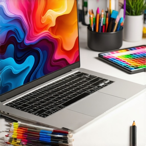
I remember the exact moment I realized I had been wasting hours struggling with a laptop that just couldn’t keep up with my creative flow. The screen flickered, colors looked dull, and my stylus lagged behind my ideas. It felt like trying to paint with a brush full of glue—frustrating and counterproductive. That lightbulb moment made me dive deep into the world of high-res displays and pen input laptops, and what I found transformed my whole approach to digital art and design.
Why Your Next Creative Laptop Needs to Shine with High-Res and Pen Support
For us creatives—whether we’re illustrators, designers, or digital painters—the tools we use are as vital as the ideas we want to bring to life. A high-resolution screen isn’t just a nice-to-have; it’s the canvas that shows every color nuance, every shadow, and every detail with breathtaking clarity. Add a responsive pen input, and you’ve got a seamless extension of your hand, making digital drawing feel natural and intuitive.
But here’s the catch: not all screens or stylus supports are created equal. Early in my journey, I made the mistake of focusing only on specs—thinking more pixels meant better quality. Turns out, that’s only part of the story. The real magic happens when the display’s color accuracy, touch responsiveness, and stylus latency come together. As Nvidia reports, pixel density and color fidelity can make or break a project, especially when fine details matter.
If you’ve ever faced blurry lines, inconsistent color, or stylus lag that kills your flow, you’re not alone. But what if I told you that the right laptop could eliminate those frustrations? That’s what this guide aims to do—help you navigate the maze of options, so you can find a device that truly supports your creative genius.
Is a High-Res Screen with Stylus Support Actually Worth the Hype?
Honestly, I used to think all screens were the same—until I bought my first 4K display. The difference was startling. Colors popped, details became sharper, and my workflow sped up. But don’t just take my word for it. The experts agree—an ultra-high-resolution display with stylus support can boost productivity and reduce eye strain, which is vital during those long creative marathons. Still, many worry about the cost or whether it’s overkill. Trust me, making the right choice can save you time and frustration in the long run.
If you’ve ever felt overwhelmed by the options or unsure if your investment will pay off, I get it. I’ve been there. But the key is understanding what features truly matter for your work, not just chasing after the latest buzz. Want to skip the guesswork? Check out our curated list of the top laptops with pen support and high-res screens. They’re designed specifically for creatives like you and me.
Now, let’s explore what makes these machines stand out and how you can pick the perfect one for your artistic needs. Ready to level up your creative game?
Choose the Right Display Size and Resolution
Start by selecting a screen size that fits your workspace and portability needs. For detailed artwork, a 15-17 inch display offers ample space without sacrificing portability. Opt for a 4K or higher resolution to ensure sharpness and color fidelity. I once grabbed a 4K model on a whim, expecting it to be overkill, but it transformed my workflow by allowing me to see every brush stroke clearly. Check out our guide on best high-res displays for artists for more options.
Prioritize Color Accuracy and Screen Technology
Look for laptops with wide color gamuts like AdobeRGB or DCI-P3, which deliver richer, more accurate colors crucial for professional work. IPS panels are generally better for color consistency across angles, which is important when you’re working on detailed projects. I made the mistake of choosing a glossy screen that reflected my studio lights, making it hard to see details. Switching to an IPS matte screen improved my color perception and reduced glare. For detailed insights, visit top design laptops with high-res display.
Test Stylus Responsiveness and Latency
The stylus should feel natural and responsive, with minimal lag. When I bought my first stylus-enabled laptop, I tested it by sketching quickly on a blank canvas. The delay was noticeable, which hindered my flow. After researching, I found models with low latency (under 10ms) that mimic real drawing sensations. Use the pen input performance guide to understand specifications better. Always try the stylus on the device if possible before purchasing.
Evaluate Stylus Support and Compatibility
Ensure the laptop’s stylus support is compatible with your preferred stylus or digital pen. Some models come with proprietary styluses, while others support universal Wacom-style pens. I recommend checking the stylus support details on best stylus-compatible laptops for digital artists. Also, consider if the stylus offers pressure sensitivity and tilt detection, which are vital for natural drawing experiences. Testing these features in-store or reading reviews can save you headaches later.
Balance Power and Portability
High-res, stylus-ready laptops can be hefty, so find a balance that suits your mobility. Look for lightweight models with powerful specs—at least an Intel i7 or AMD Ryzen 7, 16GB RAM, and dedicated GPU if you work with complex rendering. I once carried a bulky workstation on a trip, which slowed me down; switching to a sleek ultrabook with high-res display made my travels more enjoyable. For a curated list, visit top high-res, stylus-support laptops.
Test and Calibrate Your Screen
After choosing your device, calibrate the display for optimal color accuracy using tools like CalMAN or SpyderX. Proper calibration ensures your colors are true to life, preventing surprises when printing or sharing work. I calibrated mine and noticed a significant improvement in color consistency across my devices. Regular calibration keeps your workflow precise. For more tips, see enhance your Adobe workflow.
Many creative professionals fall into traps when choosing high-resolution displays and stylus-compatible laptops, often based on misconceptions or oversimplified advice. Let’s dig into some of the most common myths and reveal the hidden nuances that can make or break your workflow.
Why More Pixels Don’t Always Mean Better Art
It’s a widespread belief that a higher pixel count automatically translates to superior artwork quality. While resolution is important, it’s only part of the story. Many artists overlook the significance of color accuracy, contrast, and screen technology. For instance, a 4K display with poor color fidelity can be more frustrating than a slightly lower-resolution screen with excellent color reproduction. Experts like those at Studio Laptop Deals emphasize that balanced specs are crucial. Overemphasizing resolution can lead to investing in hardware that doesn’t serve your creative needs effectively.
Additionally, some assume that ultra-high-res screens always improve workflow. However, higher resolution demands more powerful hardware and can cause performance bottlenecks if your system isn’t optimized. This can lead to lag, dropped stylus input, and eye strain from excessive detail. Remember, the goal is fluid, natural drawing—resolution is just one piece of the puzzle.
Beware the Stylus Compatibility Trap
Many creatives buy a laptop because it boasts stylus support, but they forget to check compatibility and features. Not all styluses are created equal. Some laptops support proprietary styluses that may be costly or limited in features like pressure sensitivity or tilt detection. Others support universal Wacom-compatible pens, which offer broader options. If you rely on specific tools or software, verify that your stylus and laptop work seamlessly together. For example, the pressure sensitivity you need for nuanced shading might not be present on all models—so do your homework before buying.
Another common mistake is assuming stylus support is the same across all screen sizes and resolutions. Higher resolution screens can sometimes introduce latency issues if the stylus isn’t optimized. To avoid this, test stylus responsiveness on the device itself or seek reviews from users with similar workflows. For advanced users, understanding the impact of tilt support and pressure sensitivity levels is key—these features can significantly enhance your creative control and precision. For more insights, visit our comprehensive guide.
What About Screen Technology and Its Hidden Impact?
Many artists focus solely on resolution and stylus support, but screen technology itself often gets overlooked. An IPS panel with wide AdobeRGB or DCI-P3 coverage offers more accurate and vibrant colors than a TN or older display. Moreover, matte versus glossy finishes can affect your perception of detail and glare—a matte finish reduces reflections but might slightly dull colors, while glossy screens enhance vibrancy but increase glare. Understanding these trade-offs helps you choose a display that suits your working environment.
Furthermore, calibration is frequently neglected. Even the best displays need calibration to ensure color accuracy aligns with print or other digital outputs. Regular calibration with tools like SpyderX can save you time and prevent costly mistakes, especially when working on professional projects requiring color precision. You can learn more about optimal calibration techniques in our workflow enhancement guide.
In summary, the biggest mistake is believing that specs alone determine a device’s suitability. The real value lies in understanding the nuanced interplay of resolution, color fidelity, stylus features, and screen technology. By avoiding these misconceptions, you can select a device that truly elevates your creative process. Have you ever fallen into this trap? Let me know in the comments.
How do I keep my creative setup running smoothly over time?
Maintaining your digital art tools is crucial for consistent performance and longevity. I personally swear by a regular cleaning routine—not just for my hardware but also for my software ecosystem. Dust off your laptop’s vents and keyboard with compressed air every few months to prevent overheating, which can degrade performance over time. For my pen tablet and stylus, I ensure the nibs are replaced periodically; worn nibs can cause inconsistent lines and pressure sensitivity issues. Just like a car needs oil changes, your device benefits from regular updates and calibration.
When it comes to software, I schedule routine backups and system updates. I use Adobe Creative Cloud because it seamlessly syncs my work across devices and offers cloud storage, reducing the risk of data loss. Additionally, I run calibration tools like SpyderX biannually to ensure my display remains accurate for color-critical projects. Keeping your drivers up to date, especially for graphics and stylus hardware, prevents compatibility issues and bugs. For example, Nvidia’s driver updates often include performance improvements tailored for creative software, as detailed in their official documentation.
Investing time in these maintenance routines extends your device’s lifespan, minimizes unexpected downtime, and keeps your creative flow uninterrupted. I recommend setting reminders for hardware checks and calibration sessions. Remember, a well-maintained tool is a reliable partner in your artistic journey.
What future trends will influence tool maintenance for digital artists?
Looking ahead, I predict AI-driven diagnostics will become commonplace, alerting artists proactively about hardware wear or software conflicts before issues arise. Also, integrated hardware-software ecosystems will simplify calibration and updates, making maintenance almost effortless. To stay ahead, subscribe to updates from your device manufacturers and participate in user communities—like the one at our contact page—to share tips and troubleshoot issues quickly. Embrace these tools and routines now, and you’ll enjoy a smoother, more inspired creative process well into the future. Don’t forget to try out the calibration routine I mentioned; it’s a game-changer for preserving color fidelity over time.
The Hardest Lesson I Learned About Creative Displays
Early in my journey, I believed that more pixels would automatically make my art pop. It wasn’t until I experienced blurry lines and inconsistent colors that I realized resolution isn’t everything. The real breakthrough came when I prioritized color accuracy and responsiveness, transforming my workflow from frustrating to fluid. This taught me that a well-balanced display tailored to your needs is far more valuable than just chasing higher pixel counts.
My Essential Toolkit for Digital Artists
- CalMAN or SpyderX calibration tools: These are my go-to for ensuring my display’s colors are true to life. Regular calibration keeps my work consistent across devices.
- Wacom-compatible stylus: I trust styluses that support pressure sensitivity and tilt detection—crucial for nuanced shading and natural strokes. Check out our stylus support tips for more insights.
- High-res display with wide color gamut: A display covering AdobeRGB or DCI-P3 makes a huge difference. It’s like giving my artwork a richer, more vibrant canvas to come alive on.
- Powerful hardware specs: An Intel i7 or Ryzen 7 with 16GB RAM ensures my system can handle complex projects without lag—vital for creative flow.
Let Your Creativity Thrive—Take Action Now
If you’re serious about elevating your digital art setup, don’t settle for less. Invest in a high-res, color-accurate display with stylus support that feels natural and responsive. Remember, your tools should amplify your creativity, not hinder it. Start exploring options today and watch your art reach new heights. Your future masterpieces depend on it!
Reading this post really resonated with my own experience. I used to underestimate the importance of calibrating my display until I started working on a high-res screen with a Wacom stylus. The difference in color accuracy and responsiveness was extraordinary. It’s so easy to focus solely on specs like resolution or GPU power, but for artists, the nuances like color gamut coverage and stylus latency can make or break the workflow. I remember trying to sketch with a stylus that had noticeable lag, and it totally disrupted my flow. Since switching to a device with better support for pressure sensitivity and low latency, my work has become much smoother—and more precise. Has anyone else found that calibration made a significant impact on their color matching, especially when preparing artwork for print? I’d love to hear how you ensure your displays stay true over time.
This post really hits home for me as I’ve experienced similar frustrations with stylus lag and dull displays before upgrading. I found that investing in a device with not only high resolution but also excellent color accuracy and low stylus latency truly transformed my digital art workflow. A tip I’d add is to also look for models with good cooling solutions, as high-res screens and powerful hardware tend to generate more heat during long creative sessions. Over time, I’ve realized that calibration is key—especially when working on projects that need perfect color matching for printing or client presentations. I regularly calibrate my monitor using tools like SpyderX, which has kept my colors consistent and vibrant. Have others noticed a significant difference after calibration in how their colors translate across different screens? Or do you all rely more on color profiles for consistency? I’d love to hear some insights on maintaining color fidelity across devices in a creative environment.
Reading this article really struck a chord with me. I’ve gone through the same frustrations with stylus lag and dull screens when I first started exploring digital art on budget-friendly laptops. The moment I upgraded to a high-res display with wide color gamut support and a stylus with low latency, my workflow improved dramatically. One aspect I found crucial is not just calibration but also proper ambient lighting in my workspace to truly see the colors as intended. I’d love to hear how other artists manage their environment to get the most accurate color perception. Do you use specific lighting setups or color-checking tools regularly? Also, what tips do you have for maintaining stylus performance and screen calibration over extended periods? It’s fascinating how small adjustments can make such a difference in the final quality of our work and comfort during long creative sessions.
I can totally relate to the importance of display calibration and stylus responsiveness. Once I upgraded to a high-res, color-accurate screen with a compatible stylus, my workflow became more fluid, especially for detailed illustrations. I’ve found that consistent calibration not only improves my color matching but also reduces eye strain during long sessions, which makes a big difference. I’m curious—how often do others find it necessary to recalibrate their displays? Also, do you have favorite tools or routines for maintaining stylus performance? I’ve noticed that small adjustments, like proper cleaning of stylus nibs and using anti-glare screen protectors, can help sustain responsiveness over time. For those still debating whether to invest in higher-quality hardware, do you think the initial costs are justified by the long-term improvement in workflow and output quality? It’s all about creating a reliable environment to foster creativity, right? Would love to hear your thoughts or tips on keeping those tools in top shape.